We need to sell the virtues of London and our
university to UK and International students.
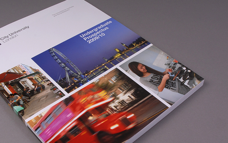
After successfully pitching, we were tasked with producing an undergraduate prospectus within a demanding timescale. Empirical to the brief was to deliver a real sense of its location within central London.
City University is a large institution based on several sites within central London. As with all universities, the need to offer some clear differentiation between competitor establishments is a driving factor.
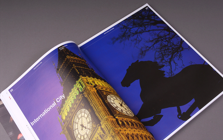
Research carried out determined that one of the key recruitment requirements was to promote this central location to prospective students both within the UK and internationally. Another key attribute was to highlight the clearly defined values of the University throughout the publication. The brief clearly reflected these issues.
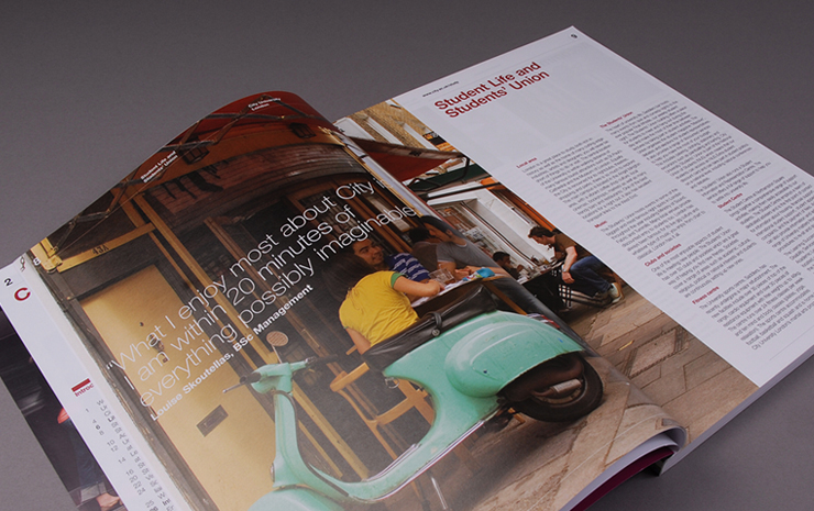
Key to the success of the design was commissioning a photographer who not only understood the locality but could work quickly and effectively within a university environment, and furthermore could determine a real sense and feel of what a central London location really is, capturing the subtle nuances of the various campuses.
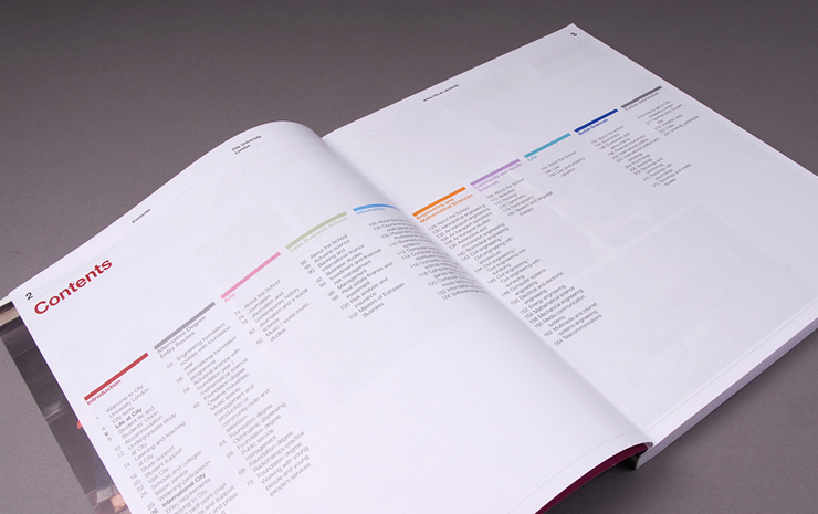
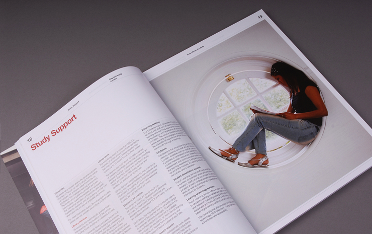
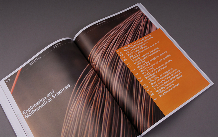
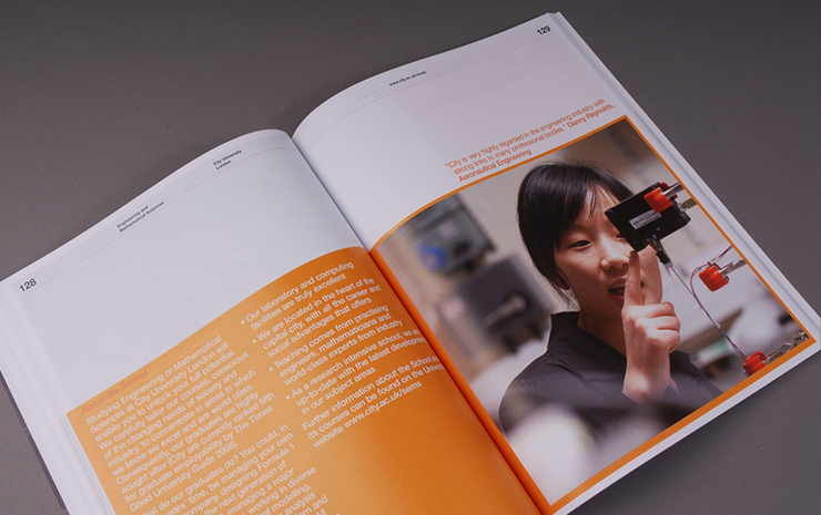
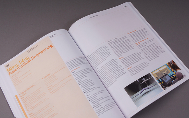
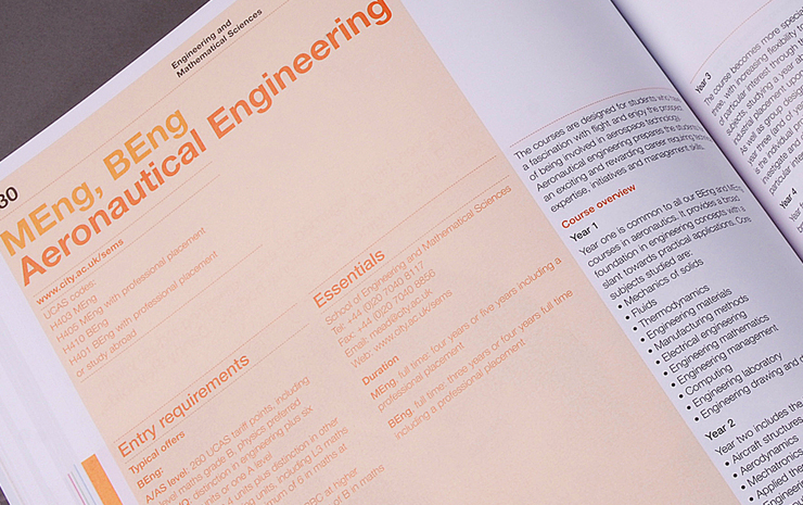
The front-end design used powerful photography to maximum effect with large full-page images. Typography is clear and uncluttered with good use of white space. Course pages had a clearly defined hierarchy of text with easy navigation to aid the reader.
As always, timescales were pushed to the limit, the main concern being to ensure new courses were validated within the given timescale. This led to an unprecedented 12 rounds of amends. Good communication between the client, the agency and the printer was paramount to ensure we could still achieve the crucial Heist mailing.
This concluded with a very happy client and a prospectus which more than matched expectations.